Client:
Noora Louhimo
Illustration and Design:
Jesús González (creative)
Take your shot.
That was the biggest lesson from this project.
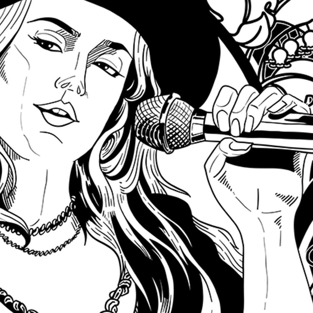
While in Finland, I went to a Noora Louhimo Experience concert, during the show, I did a sketch of her. After the show, at a meet and greet, I handed it to her and chatted with her and her team for a little bit.
Right there, she mentioned she’d be interested in working together. We swapped info… and then nothing for a few weeks. She’s a touring artist, so as eager as I was, I had to wait. And wait I did.
Eventually she reached out, and that’s when the real work began. The project was challenging and creatively energizing in equal measure. I started with rough comps and mockups, and we narrowed in on one direction.
After a few rounds of iteration, we refined the illustration, added foliage that represents Finland (bonus points if you catch the reference), and locked in a type treatment she loved.
Today, that design lives in her official shop and at her merch table in the Noora Louhimo Experience shows!
Agency: TPN
Client: Lonestar
Copy: Greg Overhauls (Sr.CW)
Art direction: Jesús González (Sr.AD)
Strategy: Brook Hollander (Associate Strategist)
Doodle Illustrations: Luke Schroeder
This is probably one of my favorite projects I’ve ever worked on.
Lone Star was launching its first Mexican-style lager, Rio Jade, and our job was to build a retail world around it without losing what made the brand special. That meant balancing three very different voices: Lone Star, the long history and culture of Mexican-style lager, and the vision of Mexican-American artist Cruz Ortiz, who created the look of Rio Jade.
Cruz’s inspiration came from the colors of the Rio Grande and the rivers of Texas. I loved the idea of taking that world and pushing it further, so we carried the sun-washed desert palette through the retail materials and added little touches of vegetation that made the pieces feel like they belonged in the same landscape.
Then we found a way to make the campaign interactive.
Lone Star has a long tradition of printing riddles underneath its bottle caps, so we created a new set specifically for Rio Jade. We wrote riddles for Austin, Dallas, San Antonio, Houston, and Texas as a whole, and had each one illustrated in Cruz’s unmistakable style.
It was one of those projects where every little detail had a reason to exist, and that’s what made it so much fun to work on.
Even launching at the beginning of a global pandemic couldn't stop it. Rio Jade was originally meant to be a seasonal release, but the campaign and the beer performed so well that it became a permanent part of the Lone Star portfolio.
Client:
Marinela
Art Direction:
Jesús González
Photographer:
Alberto Elizondo
Every first quarter, Marinela and TPN would kick off a massive production to capture content for the entire year: social, brand, partners, and everything in between.
While the main unit focused on the big approved concepts, Albert and I had a different mission: find the stories hiding between the shots.
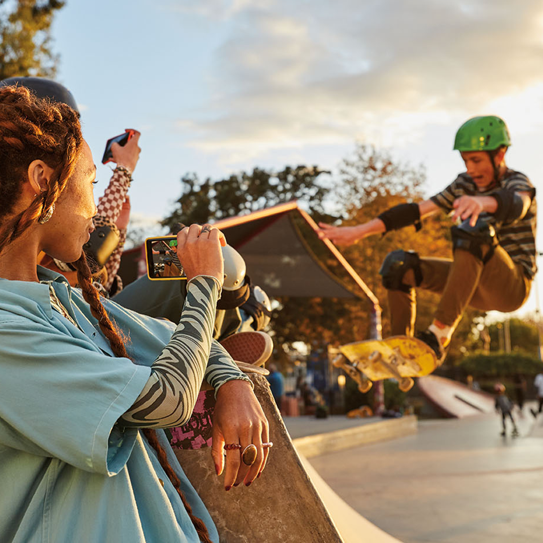
As the “unsung heroes” of the second unit, we worked fast and guerrilla-style, staging little moments, experimenting with setups, and keeping an eye out for anything that could become something more. A background interaction, a funny expression, a weird little detail—we were constantly looking for those unexpected shots that could tell a story on their own.
We didn't always know exactly where those images would end up. That was part of the fun. We were building a library of moments that could later become a social post, a campaign extension, a partner asset, or simply the perfect piece of content for a moment we hadn't even thought of yet.
The result was the connective tissue that made Marinela’s yearly content library feel bigger, richer, and a lot more alive.
Agency: TPN
Client: AT&T
Script and concept:
Ramsay Campbell (CW), Sam Zeanah (ACD/CW)
Art Direction and concept:
Jesús González (ACD)
Production:
Mandi Tinsley (Senior Integrated Producer)
Editor:
Brian Shelton
Since 2022, I’ve worked with the video team to concept, storyboard, and produce AT&T videos for in-store displays across the U.S.
The challenge was that we were often working within a stock-footage framework. That meant the creative had to do more heavy lifting. We had to find the right story first, then figure out how to tell it using whatever footage we could get our hands on.
Working closely with AT&T, we focused on real human stories that went beyond simply explaining a product. The goal was to show how AT&T fits into people’s everyday lives, and make those stories feel engaging even when someone might only see the video for a few seconds while walking through a store.
Through sharp scripting, thoughtful storyboarding, and a lot of creative problem-solving, we turned a pretty restrictive toolkit into a surprisingly flexible storytelling system.
Agency: TPN
Client: AT&T
Script and concept:
Ramsay Campbell (CW), Sam Zeanah (ACD/CW)
Art Direction:
Hannah Nabbout (ACD) & Jesús González (ACD)
Creative Lead:
Alex Morton (GCD)
Production:
Bookie Lajuwomi (Producer)
Editor:
Brian Shelton
In 2024, we finally got the chance to shoot our own footage for AT&T, and that changed everything.
For years, we had been working within an established toolkit, so having control of the production meant we could finally build the stories around the footage we actually wanted. We shot with multiple angles and intentional setups, giving us more flexibility to create cohesive, emotional narratives instead of trying to make the same template work over and over again.
We also tightened up the copy, making it sharper, more engaging, and easier to digest. And for the first time in years, we broke away from the old animation system and started experimenting with new visual styles, giving each product video its own personality.
It was a small shift on paper, but a big one creatively: less template, more storytelling.
Agency: TPN
Client: AT&T
Art Direction:
Jesús González (ACD)
Creative Lead:
Alex Morton (GCD)
TPN Producer:
Casey Edelman (Producer)
Production House:
Refinery
For Holiday 2025, we wanted to create something that would stop shoppers in their tracks, not just another promo loop, but a little moment of magic.
We partnered with Refinery to create a snow globe experience that took over every digital screen in AT&T stores across the country. Instead of leading with deals or products, we wanted to give people something they weren't expecting.
I developed the concept around AT&T’s brand characters, bringing them to life inside a swirling, animated snow globe. The result was playful, nostalgic, and a little bit ridiculous in the best possible way: a tiny winter world playing out across an entire retail environment.
The goal was simple: give people a reason to look up. In the middle of the holiday shopping chaos, we created a brief pause where shoppers could stop, smile, and enjoy a little bit of wonder.
Agency: TPN
Client: Marinela
Script:
Ramsay Campbell
Art Direction, editing and production:
Jesús González (ACD)
Creative Director:
Ross Weldon (GCD)
The incredible copywriter Ramsay Cambell and I helped define Marinela’s personality on social by figuring out the brand’s voice, how it should behave, what memes to jump on, and—most importantly—how it could have a little fun.
We built a playful visual language using GIFs, short vignettes, memes, and whatever else we could dream up across Marinela’s official channels. We had a huge library of photo and video assets at our disposal, but instead of simply repurposing them, we treated them like a creative playground, cutting them up, remixing them, and turning familiar footage into something new.
The fun part was keeping up with culture. When a meme, trend, or cultural moment started taking over the internet, we were ready to jump in and give it the Marinela treatment. Sometimes that meant turning around a post in a matter of hours while the moment was still alive.
The goal was never to make Marinela feel like a brand trying to be cool. We wanted it to feel like the fun friend who just happened to have a really good meme ready to go.
Agency: TPN
Client: Hershey’s
Concept and art direction:
Jason Hescott (CD) and Jesús González
Prototyping and Production:
Englander
The challenge was to design a semi-permanent modular display that could grab the attention of Walmart shoppers without becoming a nightmare for Hershey’s reps to assemble.
After sketching out the initial concept and getting client approval, we partnered with Englander to bring it to life: from prototyping and production all the way through packaging.
The goal was to make the display flexible enough to work across different store formats while keeping the assembly process simple and practical. We worked closely with Englander throughout production to make sure the final piece actually worked in the real world, not just on paper.
And it worked. Well enough that the display was adapted for Holiday, Valentine’s Day, and Easter campaigns, eventually becoming a recurring fixture in Hershey’s retail strategy.
Agency: TPN
Client: Hershey’s
Concept and art direction:
Brian Jackson (ACD)
Concept, sketches and art direction:
Jesús González (Sr.AD)
Oil Paintings:
Eric Cash (illustrator)
To celebrate Hershey’s collaboration with the Armed Forces, we created a series of vintage-inspired ads that looked back at the brand’s history and its role across different theaters of war.
For the visual direction, I took inspiration from an unlikely place: Marvel and DC Comics. I wanted the compositions to have the bold, heroic energy of a classic superhero poster, while still feeling authentic to the time period.
Working closely with illustrator Eric Cash, we turned those ideas into detailed oil paintings. Eric’s incredible attention to detail gave the pieces the craftsmanship they needed to feel like they could have come straight out of another era.
The result was a campaign that brought together Hershey’s history, military heritage, and a little bit of comic-book heroism.
Agency: TPN
Client: AT&T
Concep, script and translation:
Samuel Melgar (ACD, CW)
Concept, art direction and interviews:
Jesús González (Sr.AD)
Editing and production:
Bryan Shelton (VP, Content Production)
Production assistants:
Gabby McGarry and Ethan Wilder
My writing partner, Samuel, and I created a series of short videos highlighting how technology was helping Hispanic communities across the United States stay connected, build businesses, and chase new opportunities.
We wanted to tell real stories, from small business owners growing their brands to families staying connected across borders and students opening doors to new possibilities.
Working closely with AT&T, we turned those stories into short, human narratives where technology was part of everyday life, not the hero of the story, but the thing helping people move forward.
The result was a series that celebrated a community embracing new possibilities while staying rooted in its culture, family, and traditions.
Agency: TPN
Client: Ricolino
Concep and script:
Samuel Melgar (ACD, CW)
Concept and art direction:
Jesús González (Sr.AD)
Editing and production:
Gabby McGarry
We had just two weeks to take this project from an idea to a finished ad, so we had to move fast.
During the first week, we wrote the script, built the storyboard, and got the concept approved. Then, in a single weekend, we cast the talent, scouted locations, and shot the entire thing, using a true guerrilla-style approach to keep things moving without sacrificing the quality of the final piece.
The second week was all about editing, production, and getting that final approval. We got it with just one round of feedback and delivered the finished ad on time and, thankfully, above expectations.
Sometimes you don't need a huge production. You just need a good idea, a tight plan, and a willingness to move fast.
Agency: TPN
Client: AT&T
Design and visual direction:
Kendall Lamar (CD)
Copy:
Samuel Melgar (ACD/CW)
Art Direction:
Jesús González (Sr.AD), David Heflin (Sr.AD)
Photographer:
Diana Zalucky
In the summer of 2022, we were tasked with creating a new in-store graphic for AT&T. The challenge was simple: how do you make an AT&T store feel inspiring without just putting another phone in the picture?
We decided to focus on the human emotion instead.
I had the pleasure of working with photographer Diana Zalucky, whose ability to capture authentic moments became central to the direction. Together, we created a series of slice-of-life images built around adventure, community, and genuine human connection.
The result was a campaign that felt less like an ad and more like a glimpse into the experiences that technology helps make possible.
Agency: IN
Client: Newell/Sharpie
Concept and Sketches:
Jesús González (AD)
Creative direction:
Caroline Reeves
Armed with a handful of Sharpie markers and a blank 11" × 17" sheet of paper, I set out to create a career-path poster for a partnership between Chris Paul, College Track, and Sharpie.
Instead of opening up Illustrator, I grabbed a marker and started drawing.
The goal was to make something that felt personal, raw, and approachable, something students would actually want to stop and look at. I left just enough room to add fonts and event details digitally, but kept the heart of the piece completely handmade.
The result was a poster that felt less like advertising and more like something made specifically for the students who would see it.
Note: The linked video was produced by Sharpie and The Players’ Tribune. We didn’t create the video, but it captures the energy and connection students had with the poster.
Client:
Star Wars Nerds Unite Podcast
Branding and Swag:
Jesús González (creative)
I started as a fan of the podcast and ended up rescuing their branding.
The previous brand didn’t really reflect their voice, so I volunteered to give it the upgrade it deserved. But there was a deadline: the biggest Star Wars convention of the year was coming up, and it was their first time attending. That gave me less than a month to concept, create, and deliver a whole new look. With enough time to get some swag made and shipped to the convention.
It was a quick-and-dirty mission, but we pulled it off. The new branding finally felt like the podcast it represented, and fans and fellow podcasters alike were surprised by how much of a transformation it was.